Wireframes
Before working at Figma (or other design software) I like to make wireframes by hand. The methodology I like to use here is the Crazy 8 where I make 8 options for the same problem under 8 minutes.
This step can be done alone, but is ideally made with multiple people to challange different ideas.
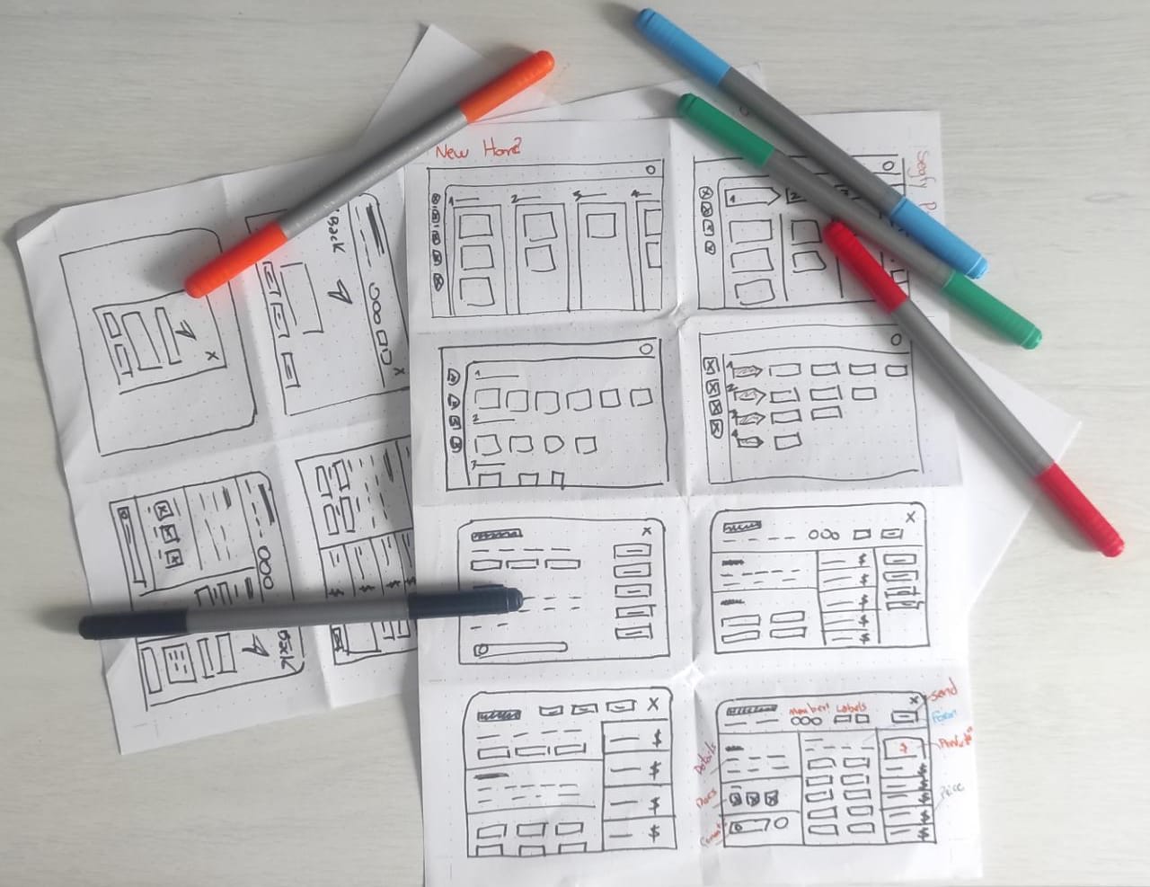
Wireflow
After talking with stakeholders and get my teams view, I proceed to make a better wireframe with the wireflow, visually showing the user flow and how things are going to be connect.
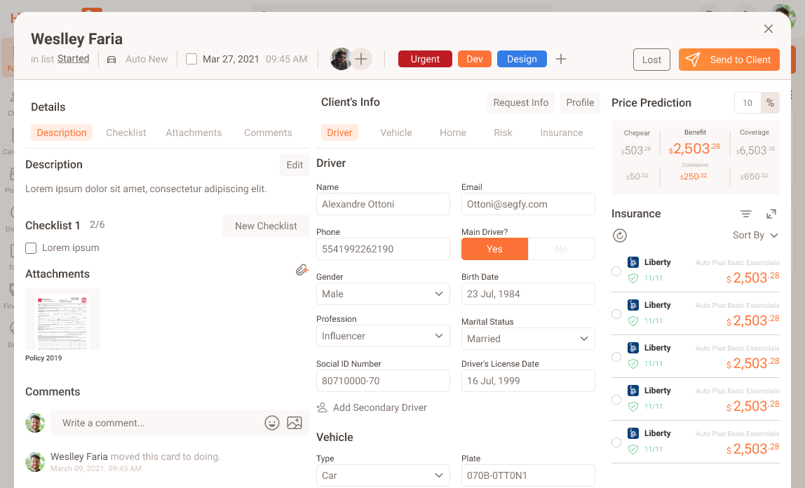
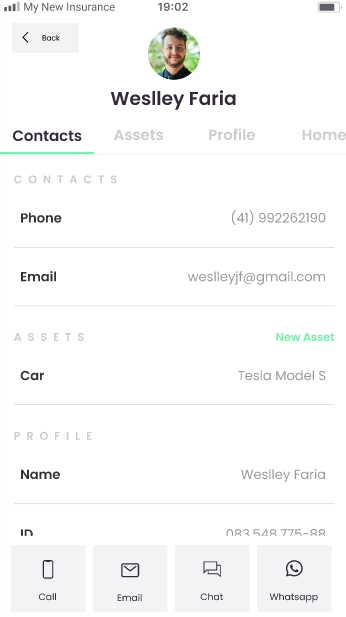
The CardAll in one place
On the original Segfy's product, we noticed that our user had to keep going backward and forward in multiple pages to get the information they need, so we compiled all the information they need in a single modal, and this gave birth to our card.
NextWe need to innovate
Segfy needed to innovate and move forward with new and fresh ideas. After I prove my innovation skills at this job, I founded an innovation squad with a Product Manager and a Developer, which latter on came up to be My New Insurance.
Protecting Financial Lifes
My New Insurance is an App and Web application to get insurace for vehicles, life, homes, pets and electronics.
This project was also an Chalanger to the currently product we had at Segfy, furthermore Segfy was running in a legacy code about to crash due to too many users online. Yet, Segfy structure was important to make this project happen.
We had to connect three types of players:

The AssuredFinal User

The BrokerSegfy's User

The Insurance CompanyBroker's 'Provider'
Segfy's Branding?No thanks
After interviews and research, we understood that we needed another branding because brokers easily thought we were competing with them. - Which was not truth at the time, but it could come up to that some day.
As My New Insurance was a test, we decided to go with another branding in the MVP, but latter on the plan was to go with Segfy's brading.
Keep in mind that Segfy is a stratup trying to find their business model.
!ImportantInsurance Legislation in Brazil
By law no one can sell insurance without a broker. This is made to protect the customers. This detail is crucial for business rules and decisions we made.
How Might We
Chat Bot
We had in mind that a Chat bot could do the job for us. The ideia behind the chat bot was that whenever the user had a doubt, they could just request for human interaction and we would match the final user with a broker.
We did a paper prototype, we discovered that the user would request the human interaction right away, they didn't enjoyed the interaction with a bot.
Just a form
The problem that the form faced is that it was huge. Actually we already had a form and it had a big bouncing because users always left it to do latter, but this latter never arrived.
Step by Step
The version that actually worked out was a mix of the form with a chat bot, the questions would show up like a chat bot, but much more similary to typeform.
Colossal Forms? Bye ByeBouncing told us something...
At Segfy we had a big form that scared our users a lot, we had a big bouncing because users woundn't fill all their information just for something that they could not even buy.
One way we found effective to solve this, was by dividing the form in four steps:
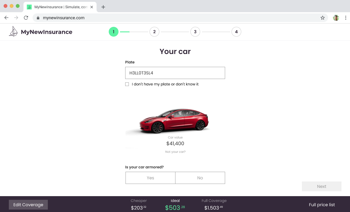
Vehicle DetailsAnd price prediction
The car Insurance is one of the one that most request information. Sometimes we just want to search for how much a car insurance costs. For this reason we made a price prediction on the bottom of the page. We were able to do that because we had literally thousands of princing done every day by brokers on the Segfy App.
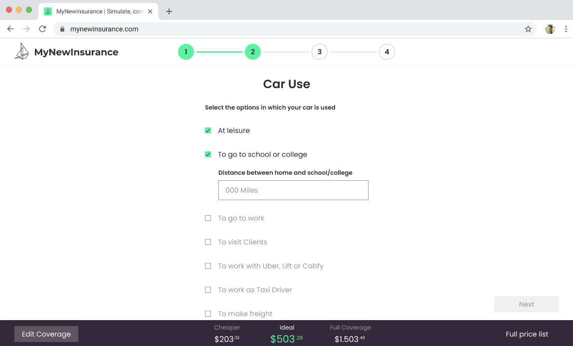
Vehicle Use
As the user keeps filling his application, our price predition gets more and more acurate.
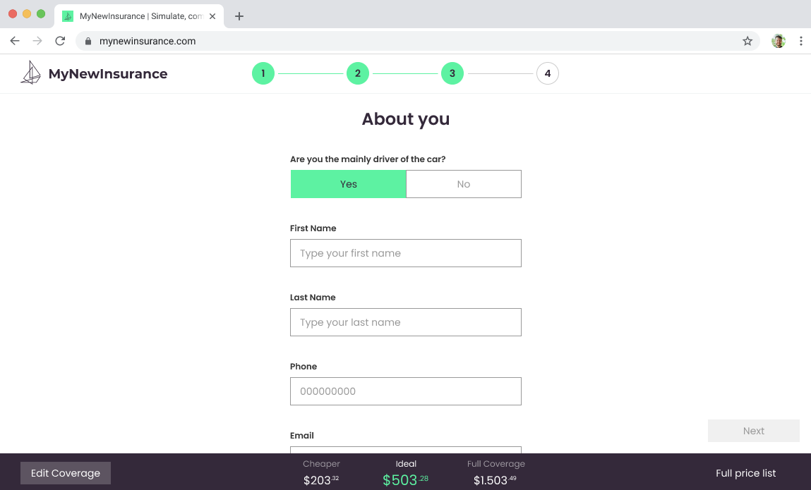
Personal InfoAnd Account Creation
From this step on, the user is seamless creating their account by providing their basic info. User will be able to login with their email and/or phone number, and will be requested to confirm their login with a 6 digit code, like a 2FA, without password.
Current Insurance
In case the user already owns a insurance, they need to tell us which one they have so there can be discounts. For the longest time you have insurance, as there will be data in their files, the insurance companies can better predict the risk this customer will offer, so this will impact on their insurance price.

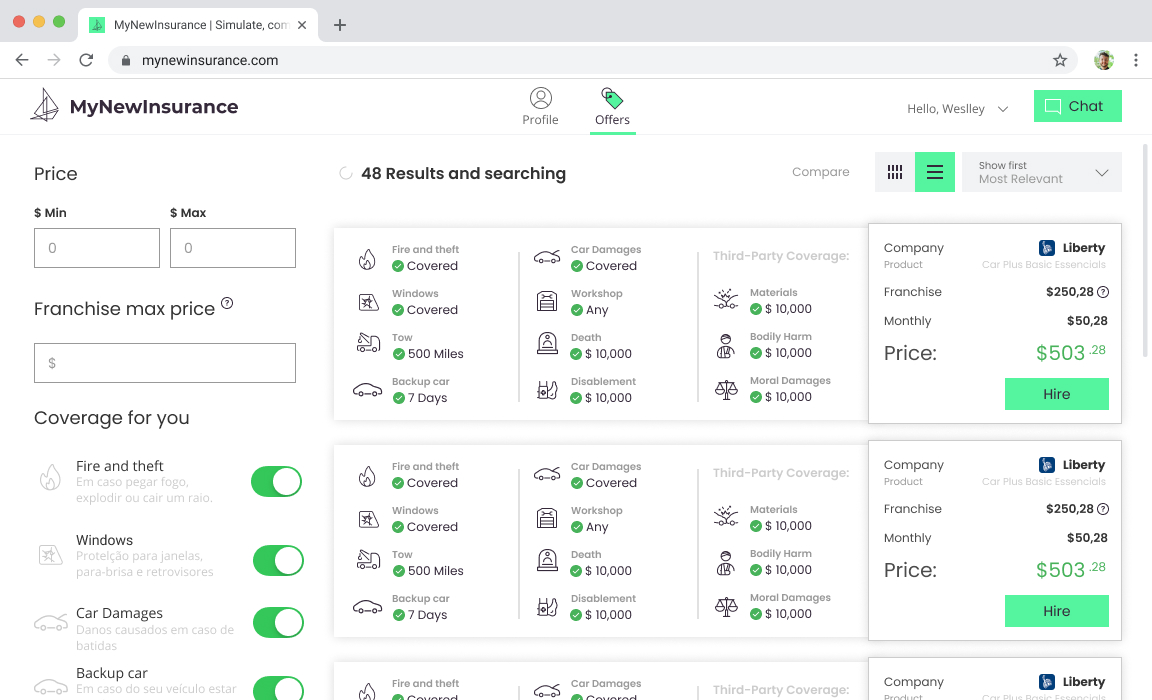
Results
Now that user completed their information they can choose their insurance, compare and buy. They can also get in touch with a broker for help and questions. On previous versions we had this chat available at all times, it was not effective because a lot of users hit the chat to talk with the broker without filling their information, as you can imagine thats a lot of time consuming for brokers.
Broker RoleLets talk about the Broker Role
The steps above were the buyer flow, but now lets see what happens on the broker side.
Our obvious inspiration here was Uber. When Uber connects drivers to passengers they need to accept or decline it. On our End this happens in a different way.
You have a new saleNew sale notification
When the end user finishes their application, we have two flows:
1) They buy the insurance without assistance;In this case user will proceed to checkout
2) They want to talk with a broker.For this type of users, they will get in touch with the broker, they can choose to recieve a call or get in touch in chat
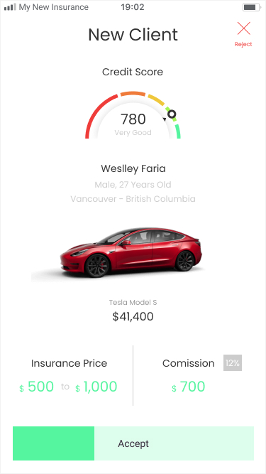
New Client
For the second flow explained above, we display this in for the broker to accept or reject the new customer.
We had to search which information to display, and which not to. You might assume that they would want anyone, but that isn't true, brokarage firms are in need to better choose their customers, there is some customers that is too costly to maintain.
We also wanted to protect user's identity to avoid any kind of descrimination.
Accepted
Once Accepted, the broker gets all customer information.
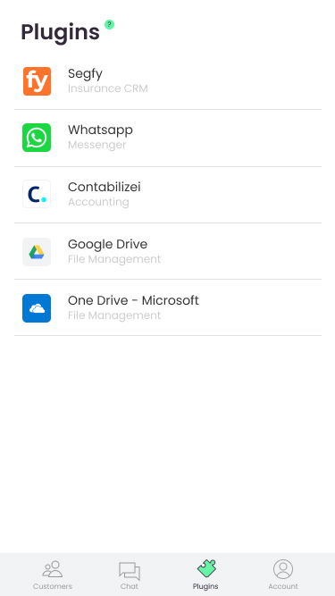
Plugins - Things we don't doFor now ;)
In order to provide usefull tools for our users at the mvp, we provided plugins to be embed to My New Insurance.