overview
Onboading
We need a fast sign-up
Objectives
Fast Sign-up
Feel the security
Go throuth KYC
Showcase products
Problems
High Bounce Rate
Broken Flows
System Instability
Outdated Visual design
Complex Onboarding
Analytics
Bounce Rate: 93%
Conversion Rate: 0.5%
Time Spent on different pages
Heat Map
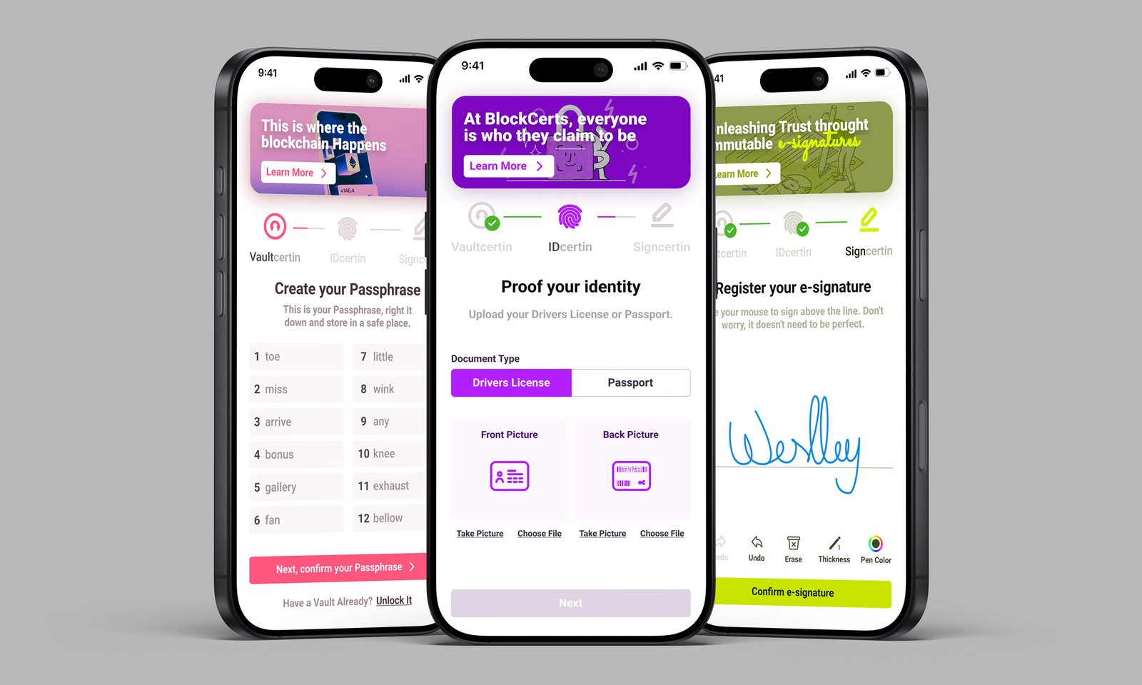
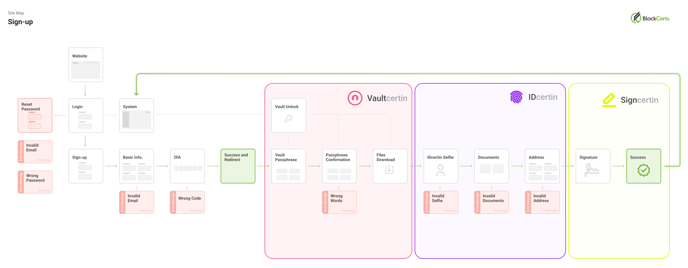
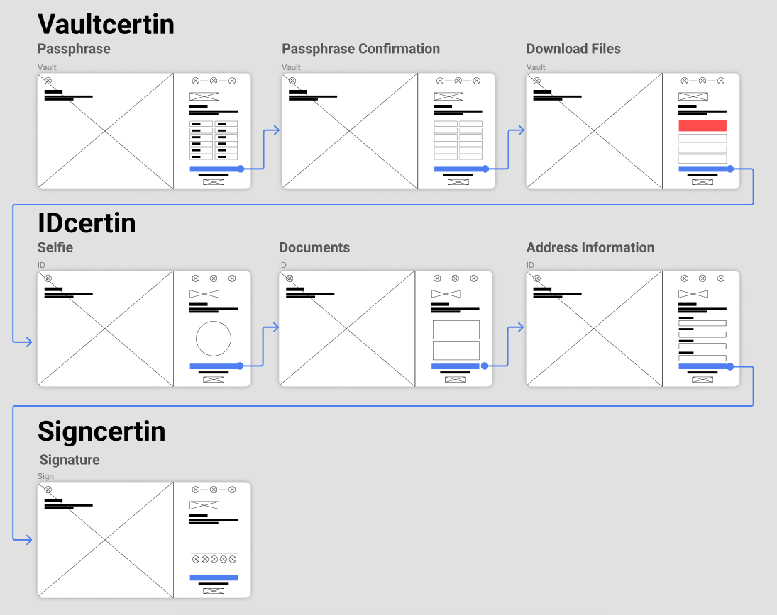
The 3 Onboarding Products:
Vault
The wallet itselfWallet inside wallet
ID
KYC
Sign
Digital Signatures
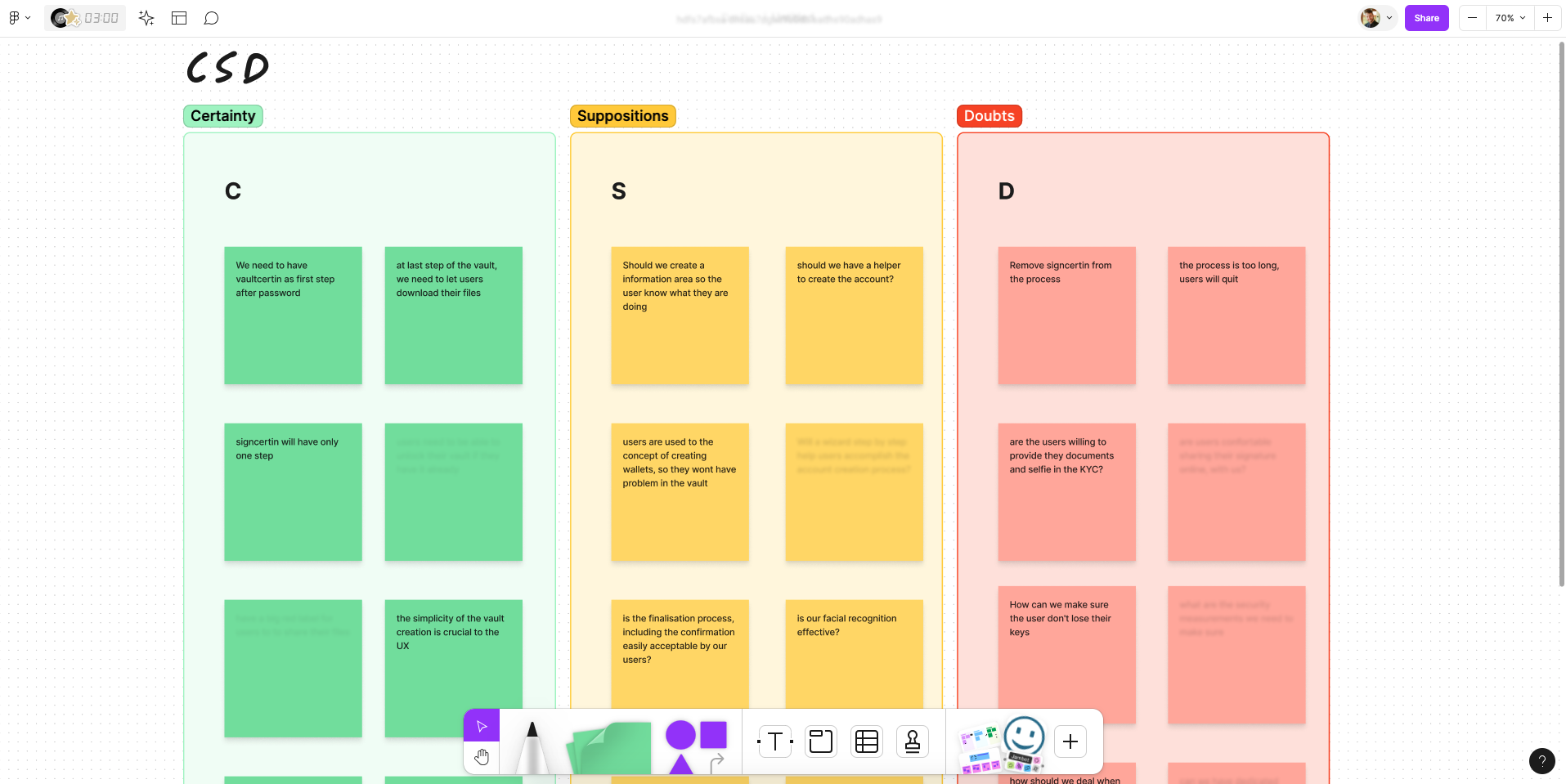
CSD
Everyone on the same page
As soon as we got in the requirements, we knew that the process would not be that fast, but once the user started we wanted they to have a wow moment. So we created this CSD. Sensitive information have been hidden!
User Interview
1. What motivated you to sign-up?
Typical Answers:
"I wanted to start investing on early stages crypto startups"
"Having identity verification with a digital siganture sounded useful to me"
"I was curious about the wallet with other products"
Insight
Motivations:
Interest in early-stage crypto investments
The promise of security and identity verification
Curiosity about an integrated blockchain ecosystem
2. Describe your experience navigating through the onboarding
Typical Answers:
"There was way to many steps"
"I wasn't sure how long the process would take"
"I was only able to create my account with help from blockcerts team"
"I thought it would be easier to create an account"
Insight
Excessive number of steps
Lack of progress visibility
High dependency on support assistance
Expectations mismatch between perceived and actual complexity
3. What challenges did you face during the sign-up process?
Typical Answers:
I didn't want to provide my picture and documents
I wans't sure why I hade to create multiple accounts for products
Some screens asked for too many information withou explanation
At one point, i though the screen froze
Insight
Reluctance to share personal information
Confusion around why multiple accounts/products were required
Insufficient contextual explanations
Poor system feedback during loading and verification states
4. What are your impressions of the visual design?
Typical Answers:
It is outdated, looks like a 90's platform
It looks not as modern as other crypto products
It has way too many things on the screen
It makes me feel suspicious about it
Insight
The outdated design impact on:
Trust perception
Prouct credibility
Perceived security
Overal usability
5. How do you feel about the number of products offered?
Typical Answers:
Overwhelmed, I didn't understand the difference between then
I want to use only 2 of them...
I liked having everything connected in the blockchain
It looks powerful once you understand it, it is like Google on blockchain
Insight
Some participants appreciate the interconnected blockchain experience, but some struggled to:
Understand the role of each product
Identify which products were relevant to their needs
Navigate multiple offerings during onboarding
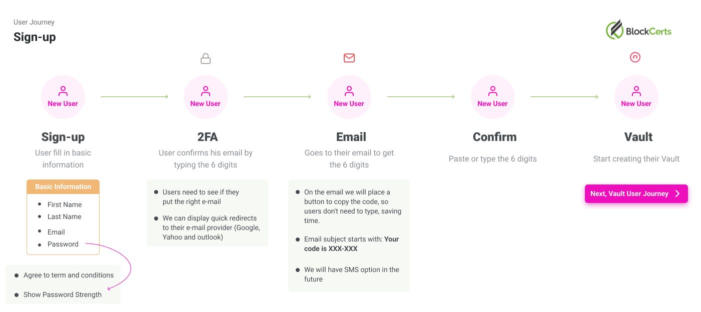
User Journey
Site Map
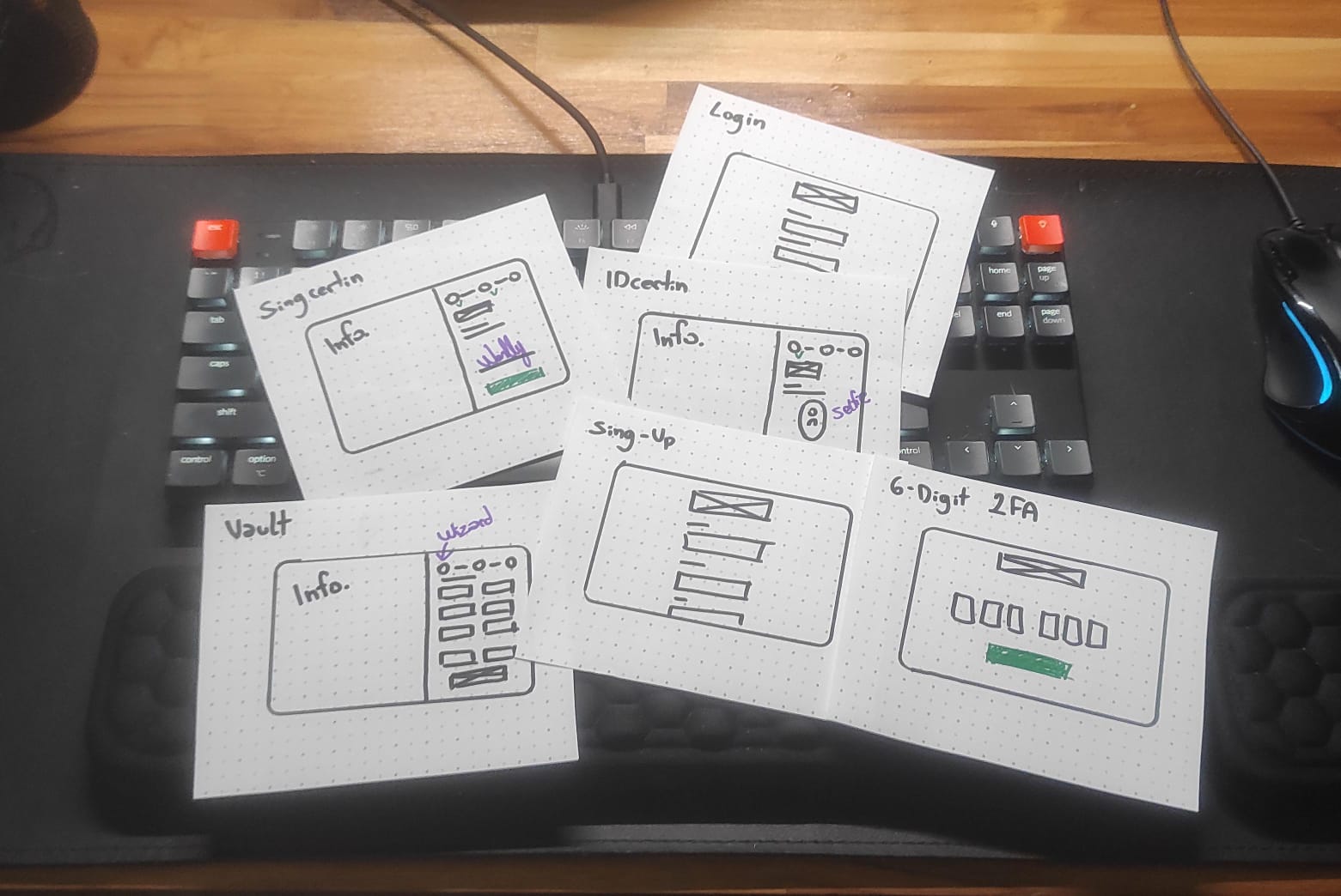
Wireframes
By hand
Wireflow
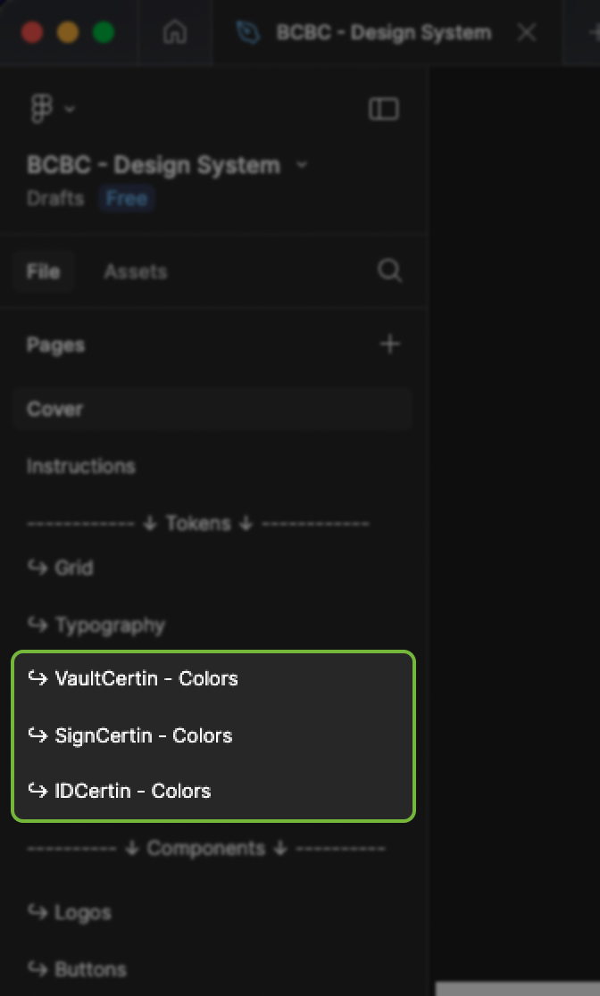
Design System Update
One Design System to rule them all
Keeping multiple design systems would be a nightmare, so we changed the colors for each product, everthing else shared the same templates.
Prototype
Mobile Prototype
Prototype works better on fullscreen mode
Prototype
Desktop Prototype
Prototype works better on fullscreen mode
Feedbacks
Comments from Hotjar

"The recent overhaul of the onboarding process is a game-changer! Now a seamless and visually stunning experience."

"You guys raised the bar for the sign-up process, wish other companies did the same."

"Wow, what a transformation! Gone are the days of frustration and glitches during account setup."

"I was never able to manage my tokens because the old sign-up never worked. Now I can invite my friends to come over."
"The recent overhaul of the onboarding process is a game-changer! Now a seamless and visually stunning experience."
"You guys raised the bar for the sign-up process, wish other companies did the same."
"Wow, what a transformation! Gone are the days of frustration and glitches during account setup."
"I was never able to manage my tokens because the old sign-up never worked. Now I can invite my friends to come over."
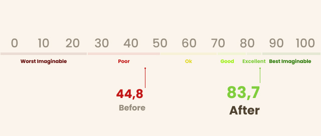
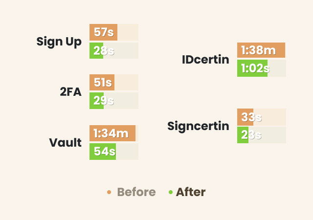
Outcomes
Drop-off Rate
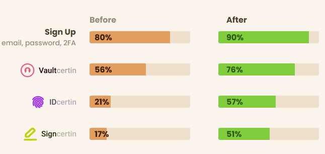
Bounce Rate

SUS
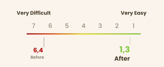
Time on task
CES